NIVEA Creme Redesign
In 1911, NIVEA Creme was launched on the Swiss market. The snow-white color of the cream inspired the world-famous NIVEA brand name, as "nives" means "snow" in Latin. Since then, the original formula has remained unchanged, symbolizing timeless care. The first tin lid, designed in the Art Nouveau style, marked the beginning of a new era in everyday skincare for all. Over the years, NIVEA Creme has become a staple in Swiss family life.
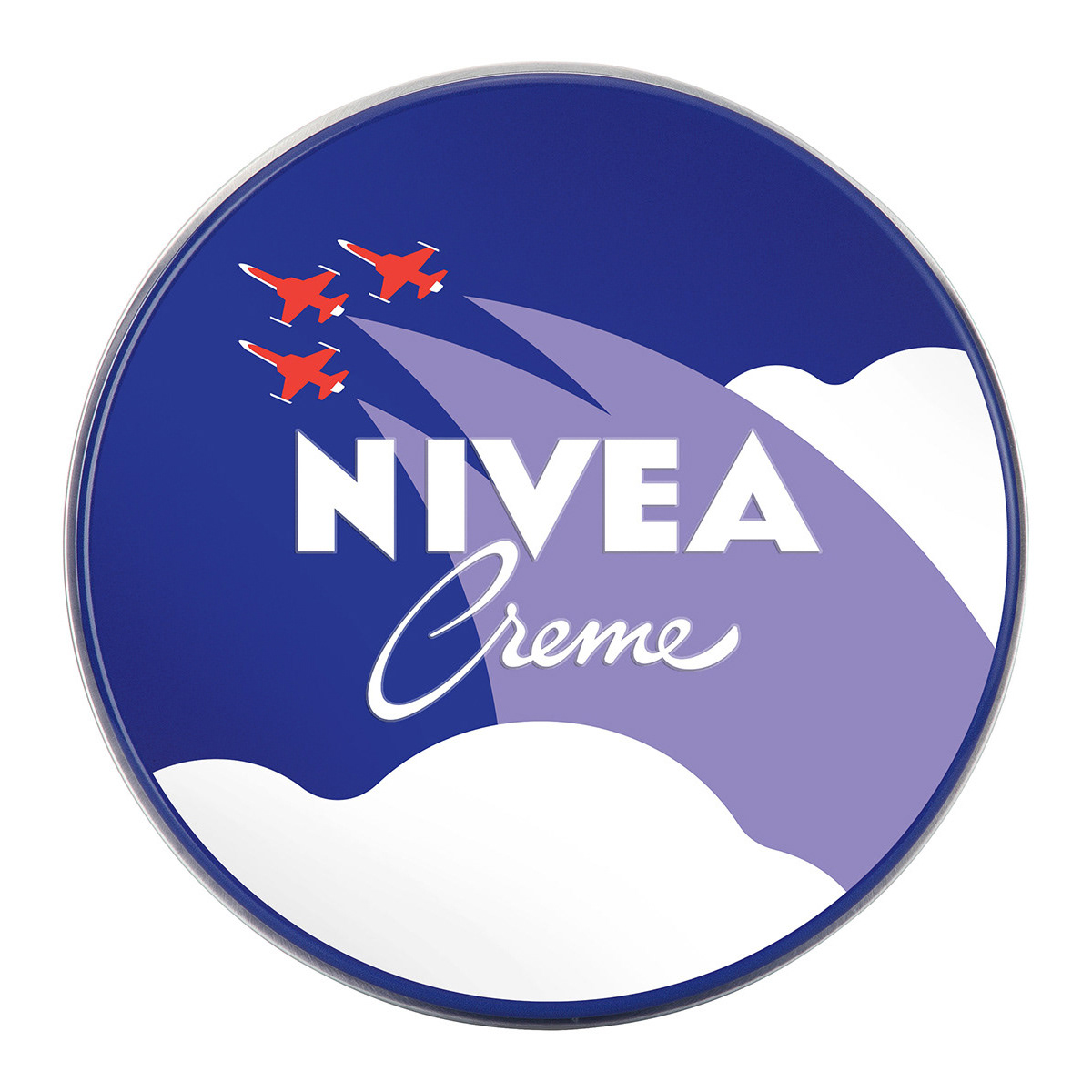
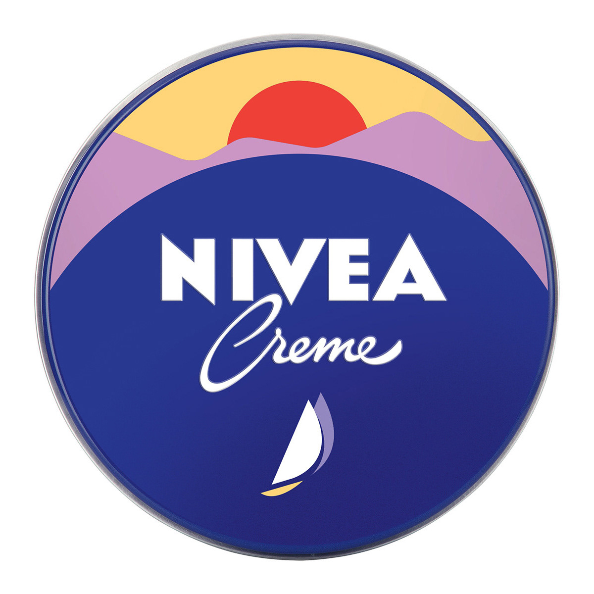
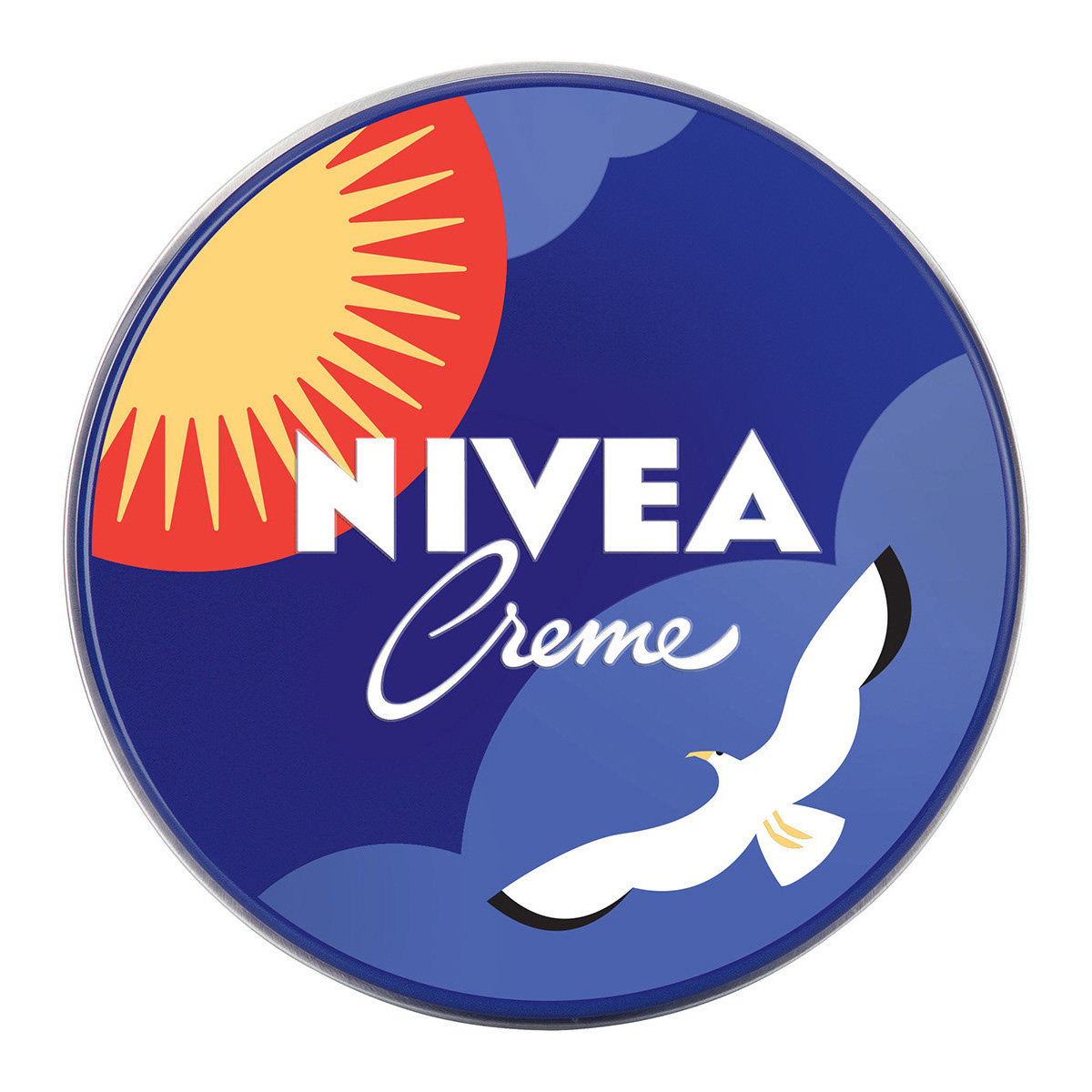
To celebrate the 110th anniversary of NIVEA Creme in Switzerland, the challenge was to create a limited edition tin that would clearly stand out from the classic version. The design guidelines were specific: 30% of the colors had to be shades of blue, 40% in the signature NIVEA Blue, and the logo had to remain in its traditional white. Additional text was not permitted. The design also had to incorporate an authentic aspect of Swiss culture, avoiding clichéd or overly touristic elements.
This open competition, curated by 99designs, allowed the Swiss public to participate in choosing the final design through a poll that attracted over 10,000 votes. Each design also came with a brief story, adding a layer of personal meaning to the artwork.


1. Inspired by Swiss Air Force Performances: This design was influenced by the breathtaking air show by the Swiss Air Force over the Swiss Alps, celebrating the precision and elegance of Switzerland's natural and human feats.
2. Seagulls of Swiss Lakes: Whether it’s the tranquil Neuchâtel, stunning Lac Léman, mountain-framed Lake Zurich, or the vast waters of Lucerne or Zug, the same seagulls make their presence known. Swiss summers are inseparable from these noisy yet endearing birds.
3. Switzerland, the Land of Lakes: With over 1,500 lakes, Switzerland holds 6% of Europe’s freshwater reserves. My first sunset at Lac Léman (Lake Geneva) remains a cherished memory, evoking the serene beauty and natural wonders of Helvetia.

